I read this post on Improvements in the Windows Explorer earlier today with quite a bit of excitement. There’s a lot to learn in here about the thought process that goes behind the Ribbon UI which was developed at Microsoft and is finally reaching the Explorer window. I, personally, welcome the changes and think it is great that they are exposing so many power features but with the ability to make the interface as minimal as needed for someone who won’t use them. As someone who’s getting into more UX design, particularly when it comes to Ribbon UI applications, this sort of stuff is invaluable.
Gruber mentioned it in an aside piece, pointing out that Apple and Microsoft are really diverging in terms of UI design1. This is certainly true when comparing the (still in Alpha) Windows 8 Explorer window with the UI changes in OSX Lion. While it is fair to argue that Microsoft’s UI is busy, I think Apple has gone a bit too far in the other direction. My largest gripe is that all the color has been removed from most icons, making it a bit harder to differentiate one gray square from another. The ribbon can be minimized in any Ribbon UI program—resulting in what are functionally just graphical menus. There is a tool (oddly, with a gray gear icon) in the Finder which is “Perform tasks with the selected item(s)” which generally accomplishes the same task. Of course, it is just a menu and limited to practical menus sizes (no different than a right-click contextual menu at all).

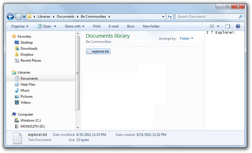
The Windows 7 Explorer dialog is similarly simple, with a menu-ish toolbar providing some context-sensitive tools along the top. This interface looks a bit like Internet Explorer 8, but that is still different enough to most Windows programs that I think many users just never got used to the controls. In IE, the main purpose is browsing. Hiding settings, etc. aren’t needed most of the time and I’d wager many users don’t even know about them. However, I think anyone using a file manager is often looking to do more than just browse those files.

Windows 8—assuming that many of these features don’t get stripped out or watered down by some larger committee (as has happened to Windows releases in the past; thus Vista)—seems to try to cater to both casual users by way of the collapsable Ribbon and even the Metro UI (which will prevent many users from even seeing the Explorer window) as well as to power users who think that reducing the number of clicks to show hidden items from five down to two is awesome. Trying to have it both ways may very well not work, as is too often the case.
But, right or wrong, the Finder in OSX Lion is still going to be nearly as lousy after Windows 8 as it was when OS X first launched2. At least the Windows team is willing to listen to criticism and make some drastic changes.
- Fair to point out that Gruber didn’t mention any criticism of either, though if I had to place money on where his preferences lie, I’d go with Apple. [↩]
- There seem to be nearly as many Finder replacements for OS X as there are Explorer replacement/add-ons for Windows. However, the popularity of the $40 Path Finder really suggests how cumbersome Finder can be. [↩]